Showing posts with label Web div. Show all posts

How to make hover button for website (mouse rollover button) with CSS/HTML


Today's post is going to focus on creating a roll over button using CSS and HTML just like the one you see above. And I will go over getting it to work with IE as well.

In website designing, website designer care a lot about website loading time and pay a great deal of time coding in a way it would make the site load faster. For instance if you want to do a rollover button, where you would have a button like this (inactive)


and switches into this image once you move your mouse over the image (button)


You would have to have two different pictures loaded into viewers computer to show this, meaning longer time to load two images as oppose to one.

Lets look at the file sizes of these two images;
They both are in gif fully optimized form,
inactive image is 4.21KB and the active image is 4KB. Total of 8.21KBs

What if you could use only a single image which has both rollover and inactive images in a single image??
Like this one..

This combined image is 7.53KBs not much of a difference but it is something. And loading a single image is always faster in website world than loading more images.

How do you make a rollover button with single image with both active and inactive images in one. First of all you have to design this button with precision. In the above button it has width of 400 pixels and height of 100 pixels which is 50 to one and 50 to other.

After you have designed the button image using this CSS and HTML code you can easily.

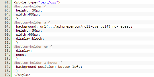
CSS code for this feature


HTML to in the body


Portions that make this code work in IE is "display:block" and associating the image to "a" rather than using <img> or linking to <div>.

Break down of the roll-over CSS effect;


With this code we are telling to move the background image of <a> tag to move up by describing its new position which is starting from bottom-left corner.

"a:hover" is the CSS hover or mouse roll-over associated code we use here in CSS.

The key for readable clean Typograhpy


Achieving readability is relatively easy; all it takes is to follow a few key practices. A readable Web page can go a long way with your users, and readability has a huge impact on their experience. Designing for the Web is all about making the user’s experience as pleasant as possible. Here are 9 tips that will help you work towards readability.

1. User-Friendly Headers

Headers are a key element in typography, Web and print alike. As mentioned, they are part of the text hierarchy and a major factor in scannable content.

First off, header size is just as important as the size of the body text. Going too big with the header with a large amount of content can throw the user off balance when reading and cause them to lose their spot. It will ultimately ruin the flow of the content and be a distraction. Headers that are too small will ruin the hierarchy of the article, too. If the header is too small, it will not draw the user’s attention as it should.

Next, it is important to provide ample space between the header and body text.

2. Scannable Text

I have already mentioned “scannable” text many times, and you have surely heard it elsewhere. Scannable text goes hand in hand with readable text. Making copy scannable consists of good use of headers, hierarchy and focus points to guide the user through the content.

So, what makes copy scannable? Well, there are many factors, most of which have already been mentioned. Header size and position, body text size, text line height, text contrast and the way focus points are differentiated all impact how scannable copy is.

Focus points are certain elements or objects within the layout that attract, or are supposed to attract, the user’s attention. This could be a header, a graphical element, a button, etc.

3. White Space
In content-heavy layouts, spacing contributes to the readability of content. White space helps to offset large amounts of text and helps the user’s eyes flow through the text. It also provides separation between elements in the layout, including graphics and text.

In the example below, white space and only white space is used to separate text elements. The layout is very clean and efficient. The user’s eyes flow from text element to text element with ease, because of the large amounts of white space.

4. Consistency
Consistency is often regarded as an important technique for usability, but it also applies to readability. Consistency in the hierarchy is important to a user-friendly layout. This means that all headers of the same importance in the hierarchy should be the same size, color and font. For example, all < h1 > headers in an article should look identical. Why? This consistency provides users with a familiar focus point when they are scanning, and it helps to organize the content.

5. Density of Text
Density of text refers to the amount of words you place in one area. Density of content has a major impact on your content’s readability. Density is affected by spacing options such as line height, letter spacing and text size. If you find a balance between all of these so that the content is neither too compact nor too widely spaced, you will have perfect density that is both readable and scannable.

6. Emphasis of Important Elements

Another key factor is emphasis of certain elements within the body content. This includes highlighting links, bolding important text and showing quotes. As mentioned, focus points are essential in Web typography. By emphasizing these objects, you provide focus points for the user. These points and objects help break up monotonous text.

Scannable text is extremely important. By providing these focus points,, you make the body text extremely scannable. Bolding key lines of text immediately attracts the user’s eye and is therefore a very important element in presenting important information.

Pictured below is an article from UXBooth. This article uses bolding and italics to point out important information in the article. This is a very readable article and very easy article to scan for information.

7. Organization of Information
Believe it or not, the way you organize information in an article can strengthen readability. Users are guided with ease through content that is properly organized because information is easier to find. This veers into issues beyond the scope of this article but is still very important.

8. Clean Graphical Implementation

Every text body needs some sort of visual support, be it an image, icon, graph or illustration. Placing the graphic in the article can be challenging. Sufficient space is needed between the graphic and text.

If the graphical element is an image, then a clean border is a good idea for providing a clean separation from the text. Borders can help guide the user’s eyes and are good for adding style to content. It is important, however, to keep borders in content simple. They should have a subtle color palette and shouldn’t be too large.

In the case of graphical elements such as icons and illustrations, space is the only separator that should be used. The content should move cleanly around the graphic without disrupting the text.

9. Use of Separators
Separators are a simple and easy way to divide text into sections in a clean and organized manner. They can be used to divide hierarchy elements, such as headers and body text. They can also be used to divide content into sections.

The simplest form of divider is a single line. These are most often used to divide hierarchy elements and are very useful for making subtle divisions that still play a big role in readability.

Another common way to divide content is to use boxes. Text boxes are excellent for separating unrelated content on a single page. They help move the user’s eyes through a complex layout. Below is an example of this on Pixelmator’s website. It uses boxes to separate content in a clean way. Notice how the boxes are defined by their background instead of a border.

10. Good Margins
You hear people say that you should use white space, but why? White space actually helps draw the user’s eye to the text. The blank area (white space) forces the eye to focus on the text. So white space will influence the flow and readability of content. Margins are one of the best white space elements and support text elements well. Margins on either side will force the user’s eye to focus inward on the core content of the article.

Margins also support the article in another way. They help separate content from the rest of the design and layout. Text shouldn’t bleed into other layout elements, especially if it is a long article. Margins help define the article and its separation.

References:
http://www.smashingmagazine.com/

Embed RSS feed into a html webpage part 2

In the previous webdiv topic about RSS feed we talked about including someone else's RSS feed into your website. In those examples we used sites like feed2js, whome take your xml feed link and convert xml to html and show the results in a java script format.

Disadvantages of this option:
Since it is a third part site, they have an allocated amount of bandwidth for a day or for an hour for each of these tasks. So if your site is heavily visited and would show this RSS feeds regularly, there is a higher chance you would exceed this bandwidth limit and have a blank space.

One alternative for this is to try the server side solution, which in most cases is download and upload to server type of operations, but could get complicated with the number of files involved.

Site like www.feed2js.org, you can download this script files and the converter files. This you will install into your server, now it will use your own bandwidth and will not run out of it as fast.

Another solution is a site called www.grazr.com This site will provide an animated/interactive widget formed using your RSS feed link, which can be placed in your website quite easily. I have tried this and it has not run out of bandwidth limit for me yet.

www.wowzio.com, www.springwidgets.com are two more websites that provide a widget from your RSS feed link.

website compatibility across browsers

In my previous Web div posts we talked about importance of a header section for a website before we went over RSS feeds on a website. Today post will focus on compatibility of a website across browsers, and some techniques used by website designers to allow a similar view from different browsers.

With Google Chrome being the newest addition to website browser family, it has become more tactful for today's website designers to develop websites that will have a consistent look across all those browsers. Because these browsers are designed differently they react to website codes differently, which makes all these troubles.

Why is it that important to care about how a website look in a different browser?
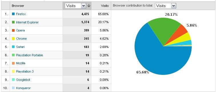
Take a look at this graph below.

This shows the percentage-wise browsers used by ashPresentom viewers in the past times. As you can see not all of them use a single browser to view ashPresentom, so it is very important when designing a website to pay close attention to across browser compatibility.

How to solve this issue?

It is impossible to make sure your website has a consistent look with all browsers and all their current and previous versions. Although you should at least test with top browsers such as FireFox, IE, Opera, Chrome.

Easy solution is open all the browsers and test every code you enter with all those browsers to make sure they look the same. This could be a time consuming process.

Another more famous alternative is the W3 quality assurance website validating service. To perform this, during your coding process you will define the document type you use, which allow validation of the code for errors through w3 website.

< !DOCTYPE html PUBLIC "-//W3C//DTD XHTML 1.0 Strict//EN" "http://www.w3.org/TR/xhtml1/DTD/xhtml1-strict.dtd" >

"Why specify a doctype? Because it defines which version of (X)HTML your document is actually using, and this is a critical piece of information needed by browsers or other tools processing the document.

For example, specifying the doctype of your document allows you to use tools such as the Markup Validator to check the syntax of your (X)HTML (and hence discovers errors that may affect the way your page is rendered by various browsers). Such tools won't be able to work if they do not know what kind of document you are using.

But the most important thing is that with most families of browsers, a doctype declaration will make a lot of guessing unnecessary, and will thus trigger a "standard" parsing mode, where the understanding (and, as a result, the display) of the document is not only faster, it is also consistent and free of any bad surprise that documents without doctype will create."
- www.w3.org

In today's blog post we talked about the importance of maintaining a website compatible across various browsers and solutions to over come this barrier.

Related Topics:

Importance of a header to a website

How to add RSS feed to a website using Javascript

In the aP last web div blog post we talked about the importance of header section of a website. Recently, I was in a demand to find out a way for including automatically updated News and Topics section from a favorite news website and include those topics with a link on a separate website.

This function is made easier with the RSS feed culture and it uses a xml format file that include news topics and short descriptions.

There are several free websites that allow you to enter the RSS feed xml link and generate a java script that will convert and provide you a code that you can include in your site to show those latest news in your site.

Here are some of the codes from RSS feed generator sites.
www.rss2java.com (excluding the first 2 (') signs)
'<'script language='Javascript' src='http://www.rss2java.com/feed.php?number=5&date=1&desc=1&html=1&new=1&url=http%3A%2F%2Ffeeds2.feedburner.com%2Fblogspot%2FaP'>'<'/script'>'"

Customize this code:
- 'http://www.rss2java.com/feed.php?number=5&date=1&desc=1&html=1&new=1&url=http%3A%2F%2Ffeeds2.feedburner.com%2Fblogspot%2FaP

- "number=5" <-- is the number of last topics/blogposts that will show
- "date=1" <-- (1) show date, (0) hide date of the post
- "desc=1" <-- show description of the topic
- "url=" <-- is where you would type in your required RSS feed link to be used for for this function. Be sure to replace "://" to "%3A%2F%2F" so java can understand this.

Option 2:
< script type="text/javascript" src="http://p3k.org/rss/proxy.r?frameColor=black&textColor=black&_=1238121698248&titleBarColor=
lightblue&compact=&fontFace=&align=&showXmlButton=
&maxItems=5&boxFillColor=white&titleBarTextColor=
black&width=200&url=http%3A%2F%2Ffeeds2.feedburner.com
%2Fblogspot%2FaP&" >< /script >

Option 3:
Feed2JS.org
http://feed2js.org/index.php?s=build

Option 4 (AJAX version):
Google ajax Feed API.
http://www.google.com/uds/solutions/dynamicfeed/index.html

Thats it for today's Web div posts. Join aP next time with another exhilarating blog post.

Why is the header of a website important

Header of a website has its importance in serving by holding valuable information that otherwise would have to be accessed from the body. Header in any case not pertaining to websites, either a document or a letter or a poster is an important part. Its main idea is to provide a valuable quick summary and theme or the title of what the rest of the document is going to be.

Header of a website is identified beginning with "< head >" and ending with '<'head'>', thus what is inside these two tags and the content of a header of a website. On a well scripted website, header usually contain markers such as '<'meta'>' '<'title'>' '<'base'>' '<'link'>', all these inside '<' head '>'

'<'title'>' this tag contain the title of the website, just like the title of an essay that goes in the header. Everything inside this markup tag you code into the header, will be shown on title of a browser when you visit the website. Therefore it is important to have a title for a website, so it can be easily identified by the viewer.

'<'meta content'>' in the meta content tags websites can usually insert keywords relating to website and description of the website, which will not be shown anywhere else on the website, or rather which is invisible to a simple viewing of the website through a browser. Yet this markup serves a great task in providing these keywords and descriptions of a website for search engines to optimize websites for search rankings as well as for descriptive bookmarking of the website.

Code to add a website description to the header;
'<'meta content="ashPresentom an educational consortium which serves in enlightening the viewers" name="description"/'>'

Next we look at '<'link'>' tags.
It is a great way to increase the website load time by separating other types of codes such as CSS, Javascript, etc. '<'Link'>' tag comes handy in these cases.

Code to load a CSS stylesheet from an external link:
'<'link type="text/css" rel="stylesheet" href="css/stylesheet.css"'>'
In this case the website will load stylesheet.css file from css directory and be readily available for the site to use. If the CSS code happened to be rather large in size implying a longer time to load, you might have noticed in certain occasions website changes its view of tables and etc. as it load.

Another great use of the '<'link'>' tag is to add a favicon to your website. Favicon is the small icon that shows up on address bar and on tabs as well as bookmarks next to title. It gives a certain flair to a website and help improving its brand recognition. You can make your own favicon in photoshop to be in a square of roughly 75 x 75 px and use a website like www.favicongenerator.com to convert the jpg file to ico and have your own favicon.

Code for adding a favicon
'<'link href="images/favicon.ico" rel="shortcut icon"/'>'
In this code, website will retrieve the favicon.ico file, which has your favicon, and place on the website appropriately.

Also another code goes in the header are loading javascript files from external directories.
Code to load javascript:
'<'script src="js/jquery.js" type="text/javascript"'>'

Next we look at '<'base'>' which specify a default URL and a default target for all links on a page.
'<'base href="http://ashpresent.blogspot.com/images/" /'>'
'<'base target="_blank" /'>'

In this blog post we talked about importance of a '<'head'>' in the website and break it down into pieces to better understand why things are there for. This conclude the educational post of WEB div.

NOTE: these tags (') has been placed outside < markups to avoid confusion with the blog site's coding and the post.

Website developing: the Web div series introduction

Today I am going to start the latest ashPresentom mini-educational series called "Web div". This post today will give an introduction to the upcoming blog posts pertaining to Web div topic area.

What is web div?
As descriptive a title it can be, web div will be a blog posts series which are going to be providing expert knowledge in website developing. The languages covered through these posts will remain mainly to HTML and CSS while I will slightly touch on java script and php on occasions. Thus simply put web div series will focus on great lessons on website developing.